Revitalizing the Transit commuter experience with enhanced convenience and reliability
Transit (Personal Project) ✴ UX/UI Designer ✴ Winter 2022 ✴ Figma
Problem
The existing public transportation systems face challenges in attracting users due to convenience, safety concerns, and lack of support for multi-leg trips.
These challenges result in a preference for private vehicles, contributing to pollution and unsustainable urban practices. As a result, finding innovative solutions to enhance the appeal and efficiency of public transportation is imperative to mitigate environmental impacts and create more livable cities for future generations.
Solution
Enter the Transit application, a comprehensive solution to effectively address this challenge.
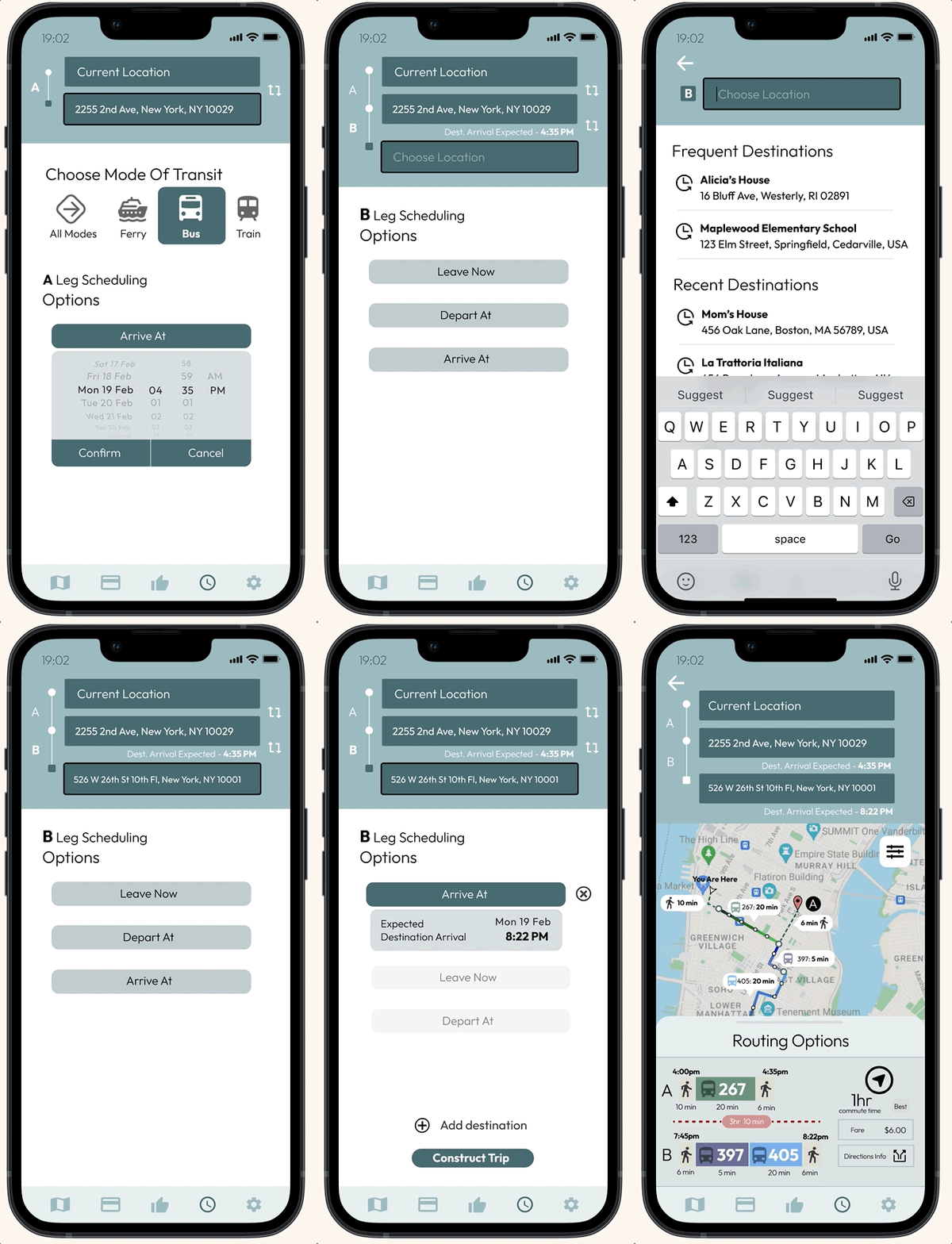
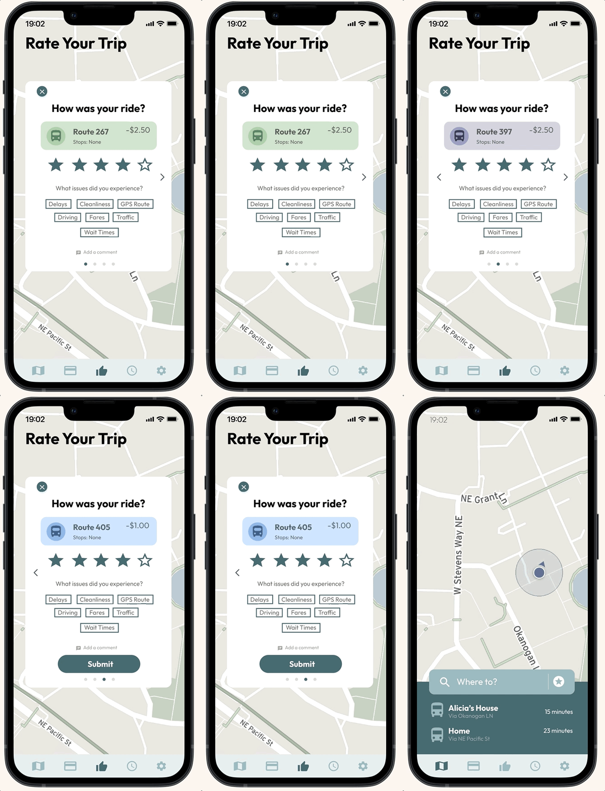
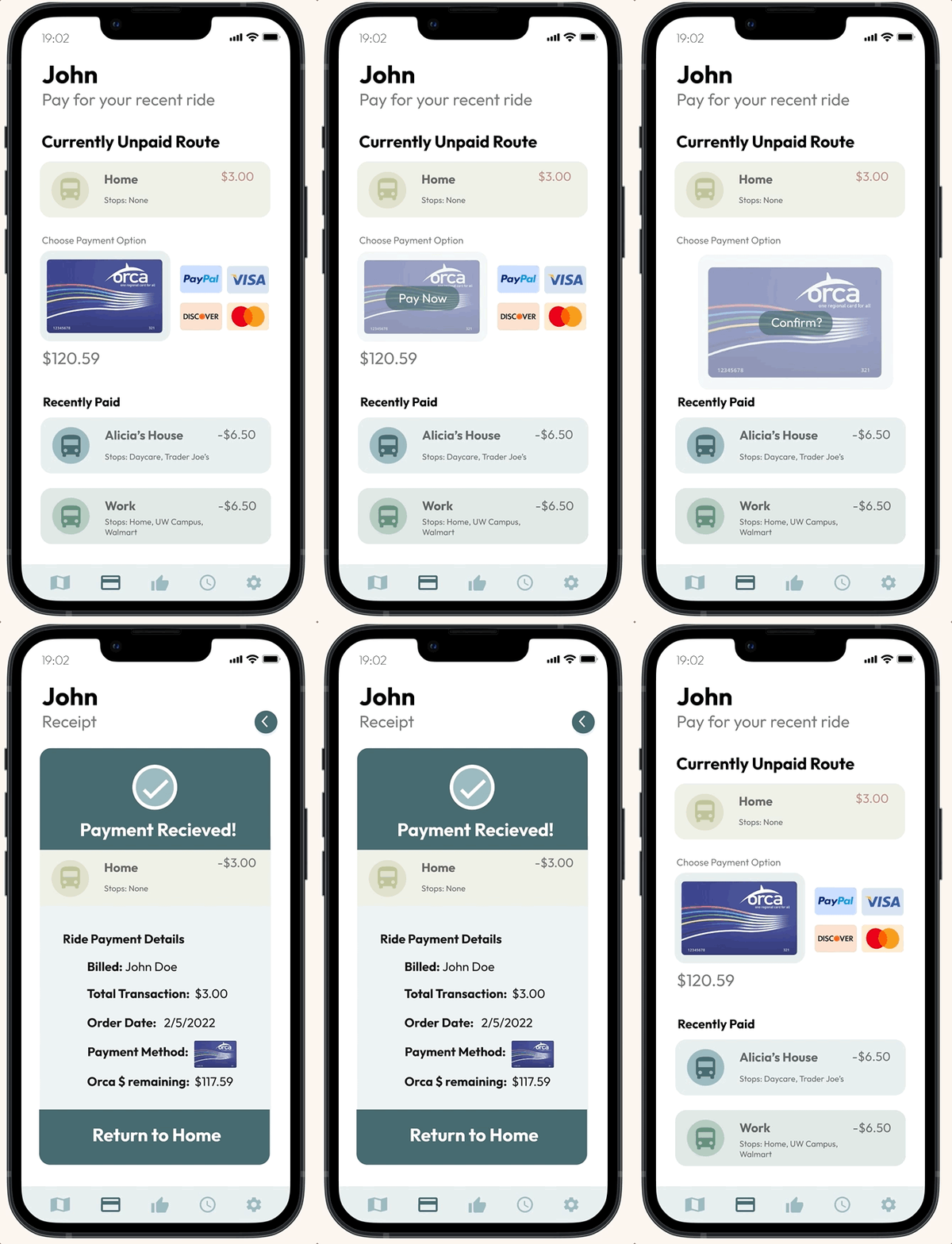
Our redesign of the Transit application improves upon the existing user interface and adds additional features such as a multi-leg trip builder, reviews and ratings, and contactless payments.
Multi-Leg Trip Builder
Ratings & Reviews
Contactless Payments
White Paper Research
A different approach is needed to encourage users to use public transportation.
Our research involved studying the challenges faced by existing public transportation systems, analyzing sustainable practices, and examining user preferences. We also gathered insights from interviews with sustainability professors at the University of Washington. Professor Kristie Ebi particularly shaped our research with the following quote:
“In the fast-paced nature of big cities, it's no surprise that many people opt out of public transit due to the hassle and safety worries.”
Competitive Analysis and The Gap
The competition lacked the integration of crucial features like reviews, ratings, and comprehensive support for multi-leg trips.
Through competitive analysis, where we evaluated Citymapper, Google Maps, Uber, and the existing Transit App, we identified the strengths and weaknesses of existing transit apps. We found that while some apps offer comprehensive trip planning, few provide features like reviews, ratings, and multi-leg trip support.
User Interviews, User Personas
By interviewing students and adults at the University of Washington, we realized that most groups faced challenges in accessing convenient and reliable transportation options.
Interviewing students and adults at the University of Washington revealed common challenges in accessing reliable, affordable transportation. Based on these insights, we created a user persona focused on users seeking an easy-to-use public transportation trip planning platform.
User Journey
The user journey map illustrates the holistic experience within the Transit app, guiding users from trip inception to successful completion.
Creating the user journey map involved outlining the stages of using the Transit app, from trip initiation to completion. We highlighted touchpoints, pain points, and areas for enhancement, ensuring a seamless experience with real-time updates, reviews, and multi-leg trip support.
Design
Choosing the best platform to make the most out of public transportation.
We chose to redesign the existing Transit app instead of creating a new solution from scratch to leverage its established user base and recognition, while also addressing the gaps in features and usability that hindered its effectiveness. Transit was a preferred choice over competitors like Uber and Google due to its exclusive focus on public transportation, aligning perfectly with our objective to provide a comprehensive solution tailored to users seeking reliable and sustainable commuting options.
Testing and Improvements
We made three significant improvements to our design following a brief usability testing session.
After we completed our lo-fi mockups, we translated our designs into a hi-fi prototype. We then conducted a brief usability testing session with five users who fell into our target stakeholder group. The main improvements are illustrated below.
Finished Product
Presenting the final version of Transit! Try it yourself below :)
View the complete Figma design here.
Conclusions and Lessons Learned
What I’d do differently next time.
In retrospect, involving transit authorities and operators from the beginning could have provided deeper insights and stronger collaboration. Additionally, we could have explored more inclusive features from the start to cater to diverse user needs.
In the future, my team and I want to address some more target stakeholders that were left unaddressed in our initial prototype:
Children: Create a 'kids mode' on our app extension and include features such as a safety rating, parental controls, and location sharing, and remove the payment screen.
Elderly: Include transit options that are less crowded and have accessible seating options. Calculate routes that involve limited movement and walking.


