Catalyzing changemakers with Electric Potential’s Newsletter Landing Page
Electric Potential ✴ UX/UI Design Internship ✴ Summer 2023 ✴ Figma + Webflow
Context
Designing for a Gen-Z-oriented social change platform.
Electric Potential is a nonprofit organization that empowers Gen-Z individuals to become drivers of social change. In March 2023, they introduced 'The Current,' a newsletter spotlighting ongoing social change events. As a UX design intern, my role was crafting a landing page for this initiative. This involved collaborating with teams (design, product, and development/engineering teams), to reshape the experience over a 3-week period. Following this, we launched the product on Product Hunt and tracked the analytics.
Result
A well-designed landing page and strategic launch can boost user engagement, fostering increased subscriptions and website traffic.
After the redesign, there was a 50% increase in newsletter sign-ups and a significant boost in website traffic thanks to the Product Hunt launch. This helped Electric Potential reach a broader Gen-Z audience and promote social impact.
Past Landing Page Design
A need for an engaging, thoughtful redesign with Gen-Z messaging, branding, and multiple CTAs.
The existing state of the newsletter landing page lacked responsiveness and Gen-Z orientation, exhibiting minimal call-to-actions, a lack of inviting elements, and an overall non-engaging design. It was also not suitable for a launch on Product Hunt due to branding issues and other factors. The initial drafts of the design can be viewed below.
Problem Statement
How might we design a newsletter landing page that inspires Gen Z to become agents of change and drives significant subscription growth?
Design Process
Wireframing, wireframing, wireframing!
Due to the project's tight timeline, I skipped paper wireframing and went directly to refining the mockups. I started with initial mockups, expanding on the old design and incorporating content pillars. I also strategically placed call-to-actions to encourage user engagement, with feedback from stakeholders. Once the mockups were approved, I proceeded to add UI elements.
Design Concept
I took inspiration from modern design trends to create the UI elements!
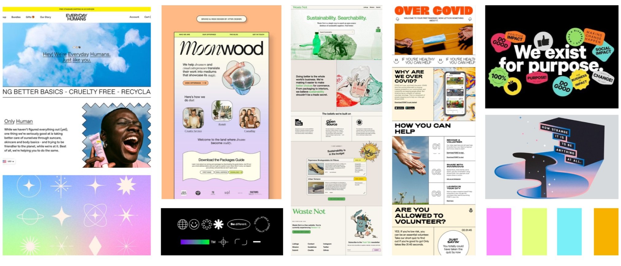
I collaborated with the visual designer on the team to create a mood board to inform design of the newsletter landing page which you can see below. We drew inspiration from modern design trends, such as bright colors and bold typography, since they appear to resonate with a younger audience. We also looked at other successful landing page designs and the visual assets they used to enhance their purpose.
Feedback Sprint
Before finalizing the design and handing it off to the developers, I conducted a final feedback sprint with the Electric Potential team.
This sprint gave me tons of valuable feedback and allowed me to revisit my design and incorporate the critiques as needed. I learned the importance of embracing feedback through this process.
Working With Developers
As a UX designer, I learned what it takes to successfully collaborate with engineers and developers.
As I worked on the Newsletter Landing Page, I made sure to provide comprehensive design documentation, all the necessary visual assets, and maintain open communication throughout the process. I was also flexible in changing designs based on feedback from developers. Additionally, being familiar with developer tools and processes, I learned the importance of clear collaboration and adaptability when working with developers and engineers. This project has prepared me to collaborate with technical teams on future projects effectively.
Final Iteration
My final designs incorporated the insights gained during the feedback sprints and were further polished.
Product Hunt Launch
We monitored key metrics for a week following our launch on Product Hunt.
Newsletter sign-ups increased by 50% in the first 24 hours of launch
Click-through rate (percent of users who clicked on a CTA) increased by 12%
Significant boost in website traffic shortly after launch
Conclusions and Lessons Learned
How did I grow from this project?
Working under time constraints: With only two weeks for design, I had to prioritize my time, so I skipped a lot of the initial wireframing and spent more time developing rapid designs and prioritizing feedback.
Developer collaboration: I made sure to provide comprehensive design documentation, all the necessary visual assets, and maintain open communication throughout the process to ensure a smooth transition to development.
Adapting creatively: Without a defined design system in place, this project challenged me to be creative. This improved my ability to think outside the box and experiment with different design elements.


